
Started as a static plan
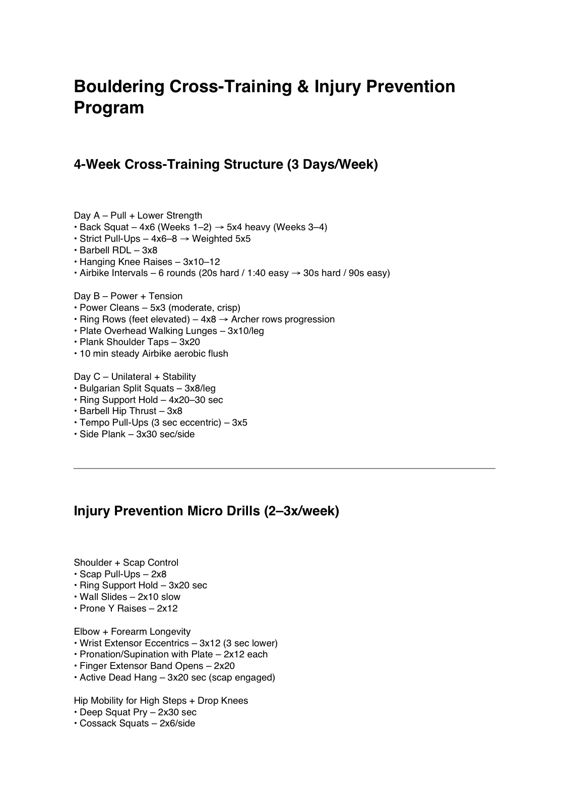
The input was a two-page bouldering cross-training PDF: three strength days, separate injury-prevention micro-drills, and programming notes.
A personal climbing routine turned into a private, phone-friendly tracker. It started as a two-page PDF with three workout types and separate injury-prevention work, then became the first place I saw how AI-assisted building could iterate an idea into a tool I would actually use.
Private Personal Tool
The live app is authenticated. The screenshots show the interface I can use from any web browser without opening my personal tracker to the public internet.
PDF To Tracker
This was not a fitness app idea looking for features. It started as a plan I was given, then became a working system through prompting, restructuring, testing, and adding the parts that made the routine usable in the gym and over time.
The input was a two-page bouldering cross-training PDF: three strength days, separate injury-prevention micro-drills, and programming notes.
I used Claude to combine the injury-prevention work into the right training days by type, then shape the plan into a full 7-day routine with a rest day built into the structure.
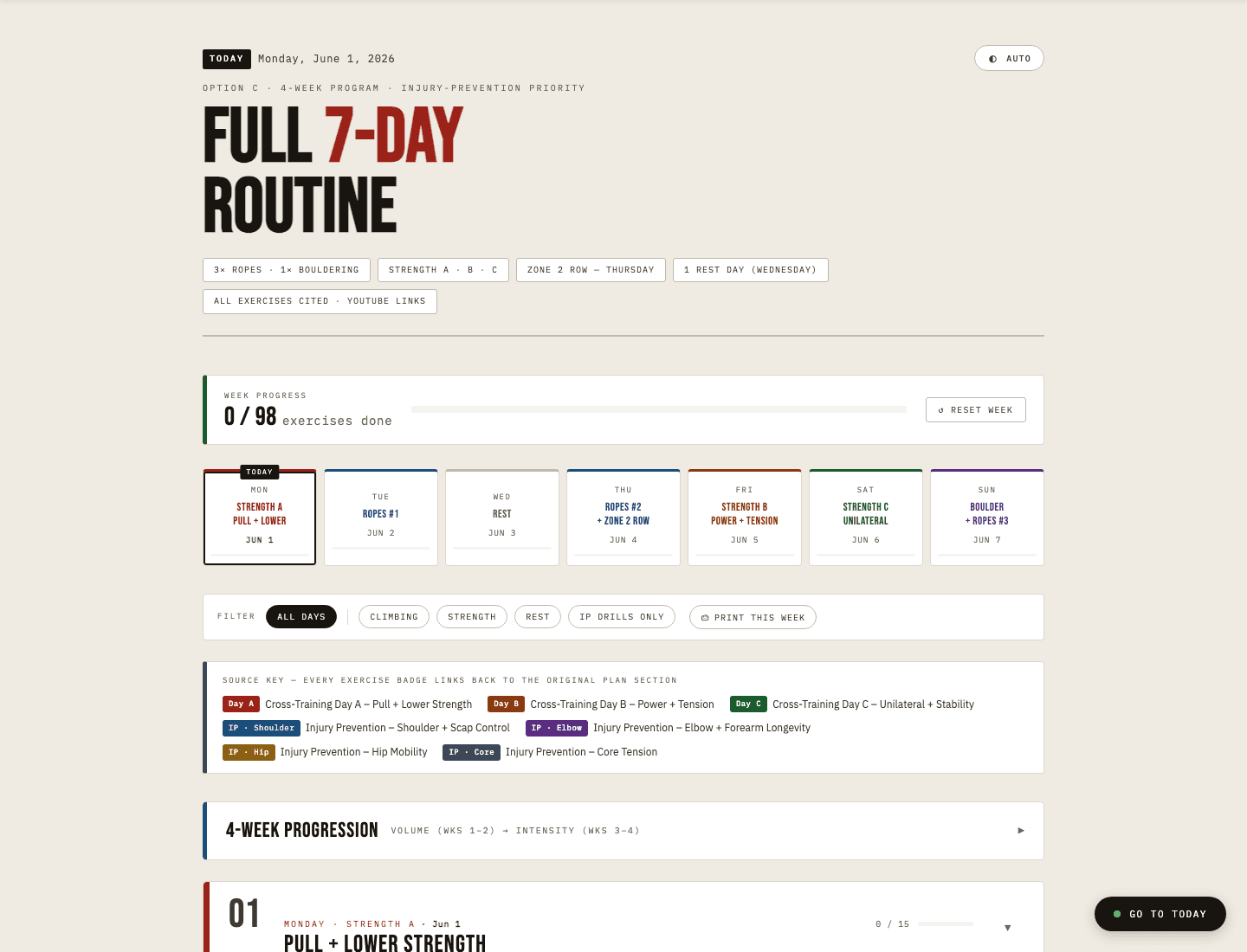
Once the routine existed, the next friction was using it in the gym and over time: checkboxes, week progress, timers, filters, dates, mobile layout, and saved state turned the PDF into a working tool.
Before
The PDF provided the ingredients: Day A, Day B, Day C, programming notes, and separate injury-prevention micro-drills. It was useful, but it was still a document.
After
Prompting and iteration turned the plan into a private tracker with a full 7-day routine, the injury-prevention work placed into the right sessions, and progress saved as the tool is used.
Product Shape
The app is small on purpose. The value is not a big feature list; it is how each addition solved a real point of friction in using the routine.
The useful version had to work on a phone at the gym, not just look good on a laptop. That pushed the design toward quick navigation, large tap targets, filters, and a simple checklist.
The routine remembers completed exercises, progression week, theme, and block start date locally. It is a small detail, but it changes the tool from a reference page into something usable during a week.
The live version is wrapped in a Next.js shell with Clerk authentication and hosted on Vercel. The routine itself stays simple; the deployment layer handles access control.
Lessons
This project is useful because it is plain in the right places. AI helped me build and iterate, but the product decisions were driven by whether the routine became easier to use.
The project started as a static PDF. Each pass made the tool more usable: merged programming logic, navigation, daily filters, collapsible sections, timers, progression planning, and mobile polish.
The routine is intentionally self-contained HTML, CSS, and JavaScript. The surrounding Next.js app exists for authentication and hosting, not because the core routine needed a heavy framework.
It started the working habit I now carry into other builds: make a focused tool, use it, find where it fails, and keep the parts that make the workflow better.
Tech Stack
The architecture is deliberately modest: keep the routine self-contained, then use the web stack only where it adds value for hosting and privacy.
Screenshots
The screenshots focus on the working surfaces: overview, progression, daily execution, injury-prevention filtering, and mobile use.
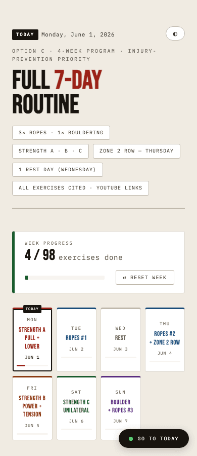
The top of the routine shows the whole week at a glance: progress, day types, filters, source badges, and the current day. This is the part that turned the plan from a document into a navigable tool.
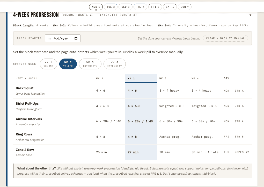
The progression layer adds planning structure without overbuilding. The user can set a block start date, see the current week, and keep the main lift progression visible.
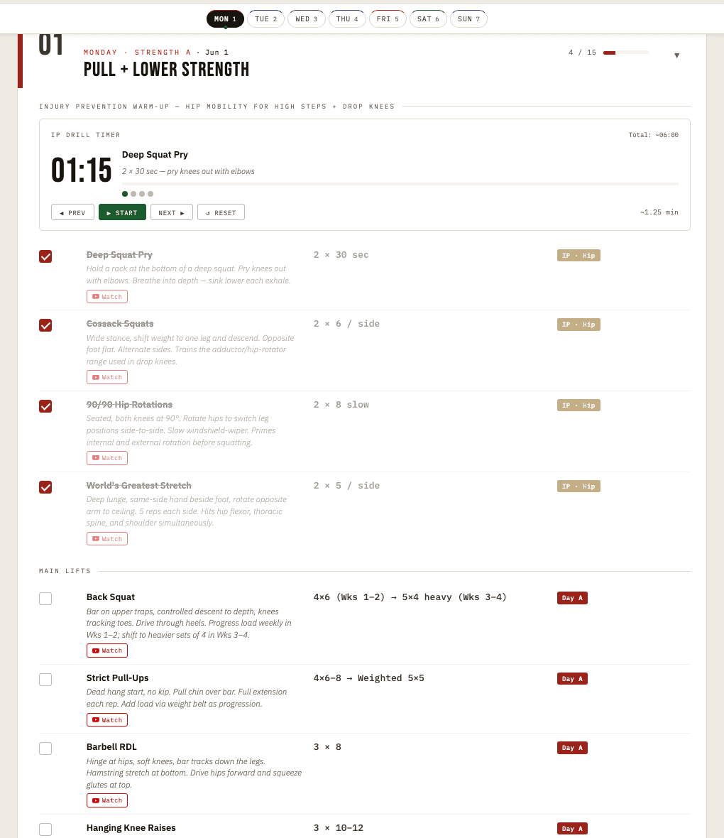
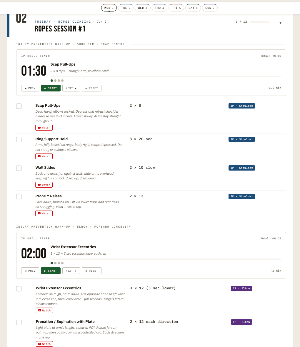
The daily view is the real working surface: timers, checkboxes, exercise notes, prescribed reps, and reference links in one place. It is designed for use while training, not for reading once.
The filter layer lets the routine collapse to a specific job, like injury-prevention work. This is a small example of the broader product instinct: reduce the screen to what the user needs next.
The phone view mattered most because that is where the tool is actually used. The public screenshot also shows why the app stayed private: it is a personal utility, not a productized fitness app.
It gave me a low-risk place to learn how to turn an idea into a working system: start with the actual friction, make the tool usable, keep the architecture honest, and improve it when real use shows what needs to change.